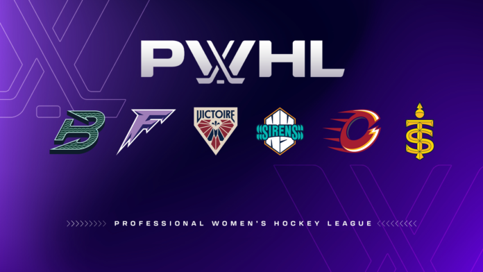
After its entire inaugural season and another long summer, PWHL fans finally have some names and logos to rally around for the league’s second year.
After a television announcement on Good Morning America, the new team names were revealed as Ottawa Charge, Montreal Victoire, Toronto Sceptres, New York Sirens, Boston Fleet and Minnesota Frost.
These names represent a change in course from the trademarked names the PWHL filed last year: Boston Wicked, Minnesota Superior, Montreal Echo, New York Sound, Ottawa Alert and Toronto Torch.
The pivot seemingly aims to connect with the local identities of the six cities, but did the PWHL get it right?
Ottawa Charge
Charge! Get ready for upwards of 7,000 fans chanting this new rally call before, during and after games at TD Place.
It’s certainly an effective call to action, but many are likely disappointed by the use of such a vague verb. It’s a stretch to hail the name as integral to the identity of Ottawa, at least, not in the way some of the other team names are.
The team claims the name is derived from the city’s motto, “Advance – Ottawa – En Avant,” yet it feels uninspired.
An electrifying presence on the ice. pic.twitter.com/KSeQjYpr8m
— Ottawa Charge (@PWHL_Ottawa) September 9, 2024
While the name is likely to be divisive, the logo is guaranteed to attract distaste.
The best way to approach Ottawa’s new logo is as a confusing Calgary Flames and Cleveland Cavaliers offspring.
They went for the obvious “O” Ottawa symbolism, but they also attempted to meld it with a “C” , as if they knew that the puzzling spikes emerging from the left side wouldn’t be enough to get the idea of “Charge” across.
Montreal Victoire
Montreal fans had better hope their team experiences some measure of success early in their history, or else their name, which translates to “victory” in English, could be used against them.
That’s not to detract from the rich history of winning that Montreal boasts. As a post on X (formerly Twitter) states, victory is “a way of life” in the city.
— Victoire de Montréal (@PWHL_Montreal) September 9, 2024
The name lends itself to a plethora of interesting victory-associated imagery, and Montreal capitalized with an art deco homage to the Goddess of Victory’s wings. They also artfully slipped in a fleur-de-lis and an “M” to cement their identity within the city.
The logo and its classic, instantly recognizable colour scheme is among the league’s best, but it would be stronger without the “Victoire” inside the crest. Most of the league’s new logos are guilty of leaning too heavily into letters and words, rather than actual imagery.
Toronto Sceptres
Toronto was expected to announce a royalty-themed name after it posted an image of a queen from a deck of playing cards on social media, along with the message, “Almost ready to rule the rink.”
That was confirmed to be the case, but with a name people likely didn’t have in mind. It’s a clever decision that wasn’t the obvious choice, but a powerful one.
The team’s social media boasts qualities of strength, precision, heritage and excellence, which the queen’s sceptre encapsulates flawlessly.
A closer look at our Sceptre. pic.twitter.com/VTNFdua20V
— Toronto Sceptres (@PWHL_Toronto) September 9, 2024
The logo is a bold yellow overlay that integrates both the namesake sceptre and the team’s letters in one clean and compact design. That being said, it lacks some of the polish expected from a professional sports team and appears to have very little three dimensionality. It would’ve benefited from more definition in its chamfered edges and the use of more colours to make it a finished product.
New York Sirens
Before their somewhat disastrous attendance and arena situation this past season, New York was seemingly set on “Sound” to connect their dual homes based in Connecticut and New York.
Free of that logistical headache, New York’s name is one of the better ones. It makes sense on different levels, paying homage to the many sirens heard in the bustling metropolis, the sound of a goal horn, as well as the mythical aquatic creatures.
It sets in place an identity of energy and rhythm that the fan base can easily get behind at home games.
Let us break it down for you: pic.twitter.com/EZpICP6iHv
— New York Sirens (@PWHL_NewYork) September 9, 2024
The logo certainly echoes that energy, from the lettering choices to the outward sonic reverberation of the letters.
But it’s hardly a cohesive design. It can’t decide whether it’s a wordmark or a logo, and the resulting hybrid doesn’t say much despite being mostly letters.
Boston Fleet
Boston appropriately nods to its rich maritime history with its new name.
A closer look at our logo. pic.twitter.com/j8csA57wIm
— Boston Fleet (@PWHL_Boston) September 9, 2024
That theme is incorporated perfectly into the logo, as the wave design fits seamlessly inside the anchor shape. The dark green is a nod to Boston’s Irish history and complements the NBA’s Boston Celtics.
It looks sleek, tells a story and most importantly, it feels like Boston.
Minnesota Frost
Minnesota — the home of the reigning PWHL champions — is known for its sub-zero temperatures, making this a sensible name choice.
The name comes with a wealth of opportunities for effective visuals, but Minnesota ends up with a sharp letter”‘F” shaped like an icicle.
Icicles in motion. ❄️ pic.twitter.com/48JAfK0NmM
— Minnesota Frost (@PWHL_Minnesota) September 9, 2024
It’s very minimalist and it’s fair to question the impact this thin letter will have on a jersey. If anything, it would serve far better as a secondary logo rather than a primary.
The biggest dig against it is its lack of tiebacks to Minnesota itself. There is something very generic about it that feels out of place in a professional hockey league.
Featured image provided by the PWHL


