After weeks of anticipation, the NHL announced on Nov. 10 that each team will get its own special Reverse Retro alternate jerseys to wear at some of their home games during the 2020-21 season.
The jerseys were unveiled on social media on Nov. 16 Fans can finally take a look at their favourite team’s jersey, after weeks of speculation about what they would look like.
The term “Reverse Retro” hasn’t been specifically explained, but it did see many teams throwing it back to one of their older uniforms that they wore at some point in their history.
The Ottawa Senators have had several uniforms throughout their history. Being a Senators fan, this is my opinion on which jersey ranks supreme.
- The best Senators jersey is the black alternate jersey with red and white horizontal stripes circling around the entire jersey, and a black “O” outlined with a thin layer of red and white on the front.
The names and numbers on the back were written with big white letters, outlined by a thin red and black line. This jersey was dubbed the heritage jersey and designed to commemorate the Senators’ 20th anniversary season. It served as the Senators’ alternate uniform from 2011-2017. It paid homage to the “O” uniform the Senators used in the early 1900s when they were called the Ottawa Silver Seven.
After the NHL 100-year classic between the Senators and Montreal Canadiens, in December 2017 the black “O” uniform was replaced with the red “O” uniform the Senators wore at that game. The red “O” is now their alternate. I love the red uniforms, but I prefer the black ones slightly because they are more classic.
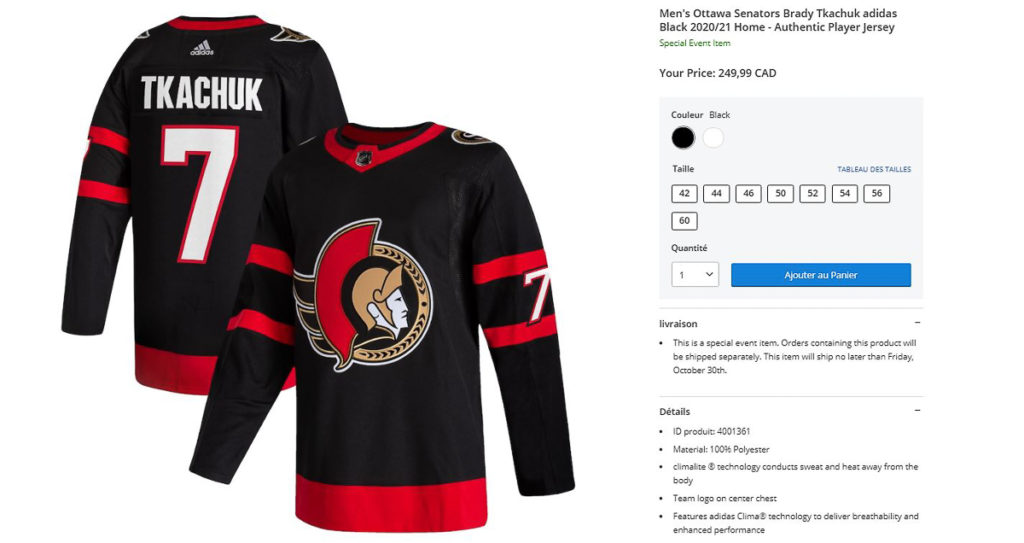
- The second best jersey is the black jersey that has black sleeves with red and white stripes circling around the sleeves. At the bottom of the jersey, there is a big white and red stripe that circles the entire uniform. On the back, the numbers are written in big white text with a faint red outline. The nameplates are written in white letters.

The Senators wore this jersey from 1992 when they re-entered the league, all the way until they made the Stanley Cup finals in 2006-2007. Sadly, the logo received criticism for not looking like a Roman Centurion. The laurels on the helmet’s visor and surrounding the head, along with the crest, were much more Greek in origin, but Ottawa fans were just happy to have a hockey team again, wrote Dayton Reimer for TheHockeyWriters.com.
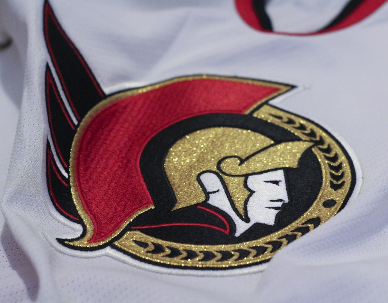
Luckily this logo has returned, as the Senators announced that starting in the 2020-21 season, this will be their primary logo.
The NHL announced on Nov. 16 that the Senators’ Reverse Retro jersey would feature the 2D logo, but with a red background, in addition to black stripes on the sleeves and on the bottom of the jersey, black numbers and a white nameplate.
I am a huge fan of this logo, so I love that their reverse retro jersey has the same logo as their new current home and away jerseys. I think the red background complements the white, black and gold colours on the logo well. Also, because of the white outline around the logo, the red background really helps the logo pop off the jersey and appear 3D. It’s good when a logo is noticeable from far away—that means the colour scheme and the details were done well.
Having a red background on the reverse retro jersey is fitting, considering red was the colour of their home uniform from 2007-2020, which had the logo I was used to and grew up with. The designers did an amazing job with this jersey and it is pretty much all I could have asked for. If I could make one change, I would add a gold stripe with black laurels—like from the alternate jersey of 2000-2007—just to make the red background more appealing.
- The third best jersey is one many new Senators fans are familiar with: the classic red background with red and white stripes on a black sleeve, a white accent on the side, and big white-lettered nameplates and numbers with a black outline. The Senators wore these jerseys from 2007-2020 making them the second longest living jerseys in team history.
I prefer the red numbers on the white jersey more than the white numbers on the red jersey. The Roman Centurion has a golden helmet with a red crest on top like the logo from 1992-1993, but the helmet and crest are more apparent and realistic in the older logo. However, the newer logo’s scarf does a better job of covering the Centurion’s neck, whereas the older logo’s scarf appears to be blowing in the wind.
This logo was the one I grew up with, so it gets nostalgia points. Both of these jerseys are very cool, I just like the all-red one a little bit more. I feel the red jersey’s background blends in nicer with the logo. The red numbers on the white jersey are cool, though. However, this 3D logo worked a lot better than the team’s first attempt at a 3D logo.
- The second worst logo in my opinion is their first alternate uniform, which was introduced in 1997 and lasted until 2007 after a few minor tweaks during its use. The asymmetrical black slash looked awkward to the eye and made it feel like the jersey belongs in Star Trek. The logo itself was simultaneously too realistic and too cartoony, which took away its intimidation factor.
The dark spots around the eyes earned it the nickname “Senagoth” among fans. The purpose of the thin, red squiggly line was argued about by Sens fans. “Was it a cape, an arm, or a piece that the graphic designer forgot to finish?” Reimer wrote. Critics called it one of the worst jersey designs of the decade. I wouldn’t go that far, but the other front-facing logo is much better than this one.
From 2000-2007, the Senators introduced a new alternate jersey that had a black background with red, white, and golden stripes on the sleeves and on the bottom of the jersey. In the thick golden stripe, there are black laurels just like the ones in the golden visor. The stripes on the sleeves and on the bottom of the jersey fix the issue of asymmetry, making the black version of the alternate jersey the third worst logo on the list, but issues with the logo itself still persist.
- Finally, the worst logo on the list is another black alternate jersey that was used during the 2008-2009 season. A trend disliked by many was emerging in professional sports where teams would use their nicknames or abbreviated versions of their nicknames as logos. This jersey was inspired by the Tampa Bay Lightning, whose jersey logo simply read “BOLTS.” The colour scheme of this jersey is OK, using red and white to highlight an otherwise dark and colourless jersey. The white numbers with red lining is cool, but just having “SENS” as a logo is not very creative and thus ranks as the worst jersey on my list.


